 Sign in to Mod The Sims
- Site Map >
- Modding and Creation >
- Creator Feedback Forum >
- Sims 4 >
- Lots & Housing - Mall of Sims - WIP; Feedback Sought
- Site Map >
- Modding and Creation >
- Creator Feedback Forum >
- Sims 4 >
- Lots & Housing - Mall of Sims - WIP; Feedback Sought
Replies: 11 (Who?), Viewed: 3510 times.
#1
 13th Feb 2015 at 3:22 AM
13th Feb 2015 at 3:22 AM
Posts: 2,287
Thanks: 289 in 2 Posts
The mall is currently placed on the "Oakenstead Drive" lot in Willow Creek, in hopes of the new neighborhoods coming with GTW providing a large 50x50 lot in a more urban setting, if not, then the mall shall just stay where it currently is. Anyways, without further ado some pictures with captions!

Head on overview of the mall front/main entrance. The black wall by the musical statue is supposed to be a "standing billboard" I suppose. It kind of took up that empty space on that side of the lot.
The windows on the overhanging part of the mall are randomly placed because I didn't want a clean look, and there are some spots without windows because after a while the look became tiring and looked like a cheap fully-glassed KMART (I dunno how to describe it but it bugged me).

Different angle of the front

Another angle, this is so you can see it from all the different angles, and yes most of the mall is unpainted, I need some feedback on the color scheme I have so far.

Eastern portion of the mall along with room for a possible side main-entrance (this is more obvious seen from the interior because there are currently no doors, this will also only happen if there is a lot in a more urban setting).

Back of the mall, nice and simple, straight to the point. Not afraid to enhance it though (although there isn't much room), also room for possible back entrance.

Back Western Corner, you can kinda see the building block style I was going for here.

Western side. The bottom floor with windows is the food court area//didn't want to overdue windows on this side either

Current roofing status and birds eye view for the layout. (Don't worry, it won't all be green!)

First floor semi-floor plan (no stores have been laid out)

Second floor with balcony overlooking the main corridor, also probably the definite store floor plans. Also food court floor plans laid out to the bottom left.

Third floor with balcony overlooking main corridor, only one store plan which is part of the two story store from the second floor.
Any and all feedback is welcome! I want to make this lot as close to my tastes and as close to all of yours since I shall be sharing it with you all. Thanks in advance, hope I get some replies.

Advertisement
#2
13th Feb 2015 at 1:11 PM
13th Feb 2015 at 1:11 PM
Posts: 195
Thanks: 1221 in 8 Posts
Looks amazing, just one thing though. I think the front-left looks a little too modern, and looks like a house. I like the main entrance and I think if you redesign the front-left to match the entrance a little more, it would look perfect. (This is not meant to be offensive or mean, just some simple feedback)
#3
13th Feb 2015 at 6:30 PM
13th Feb 2015 at 6:30 PM
Hello. I see you have an ambitious start.  I am anticipating the new Ep also. I would say there are too many windows. Most malls do not have large windows all over the building. They are faceless and use brick or textured walls. The only exterior 'shop' windows are on ground level and at the large entries. Inside, I would expect to see a lot of windows but not outside.
Let's see what you've done since the first post.
 I am anticipating the new Ep also. I would say there are too many windows. Most malls do not have large windows all over the building. They are faceless and use brick or textured walls. The only exterior 'shop' windows are on ground level and at the large entries. Inside, I would expect to see a lot of windows but not outside.
 Let's see what you've done since the first post.
#4
13th Feb 2015 at 11:25 PM
13th Feb 2015 at 11:25 PM
Posts: 2,287
Thanks: 289 in 2 Posts
Anddd fast forward 20 hours later! Viola!

New front left-end, the diagonal full glass wall is where the food court will be, and I'm thinking about doing a two story food court? Let me know what you think

Another angle

What the new left-corner looks like now

Bonus angle, because it really shows that the mall is really taking shape and looks a lot more like a mall! Especially with all the decor I've added. Thanks @simalaray44 for that mention of the left-end

And, another.

And an angle from the right corner with the new additions. Also note the color change, let me know if you like it, and the color scheme!

Birds eye view with the new addition. I haven't done the new floor plan yet, so that'll be in the next part, also you can see the rooftop garden and what not better here
Thanks for the feedback! After you pointed out that it looked too modern and like a house, it became an eyesore to me and I couldn't stop picturing it being a home lol. That's not your fault though, as I wasn't entirely sure about it anyways, that's why I went ahead and rehauled the entire thing to suit the entrance and right-side a lot more. I believe the rehaul added a bit more depth and mall look as well, so thanks for that! Also no need to put a disclaimer, I take no offense to comments.
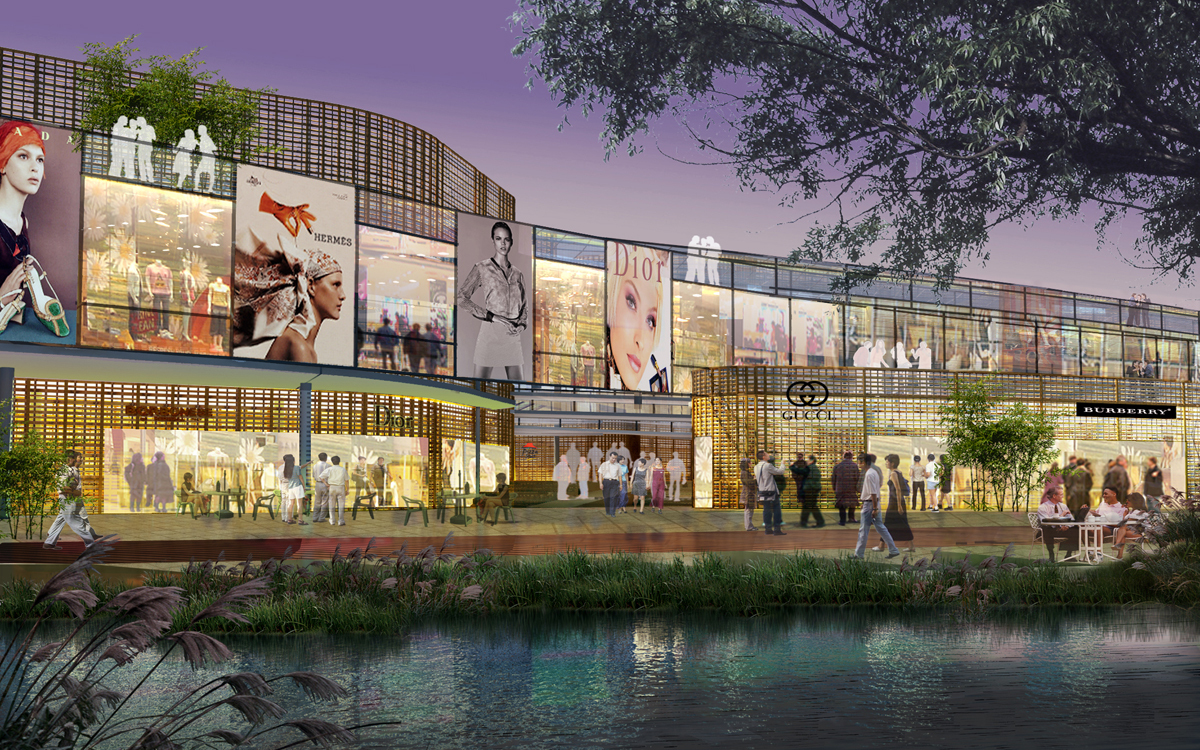
Hi there! Yes, it was a very ambitious start, and I agree GTW looks superb, hope it delivers! In regards to too many windows, I know, and I was a little unsure about that, however I didn't want a bland looking mall, so I think I may have gotten it right with the rehaul, and I've taken out a lot more windows and added "billboards" if you must, as decoration and to give the mall that more commercial look in place of the windows. Additionally, I'm modeling this mall after a couple malls nearby me that have been recently renovated (3-5 years) or are undergoing renovation, as well as a few inspirational renderings for some mall exteriors I found on google which I will leave a couple of them below. It seems to me that it's more common for an urban mall (which is what this is meant to be) to have more windows than facelessness.


Again, thanks for the feedback guys! I really do appreciate it, I wish this forum was a bit busier for more diverse critiques, but I suppose it'll grow down the line.
New front left-end, the diagonal full glass wall is where the food court will be, and I'm thinking about doing a two story food court? Let me know what you think
Another angle
What the new left-corner looks like now
Bonus angle, because it really shows that the mall is really taking shape and looks a lot more like a mall! Especially with all the decor I've added. Thanks @simalaray44 for that mention of the left-end
And, another.
And an angle from the right corner with the new additions. Also note the color change, let me know if you like it, and the color scheme!
Birds eye view with the new addition. I haven't done the new floor plan yet, so that'll be in the next part, also you can see the rooftop garden and what not better here
Quote: Originally posted by simalary44
| Looks amazing, just one thing though. I think the front-left looks a little too modern, and looks like a house. I like the main entrance and I think if you redesign the front-left to match the entrance a little more, it would look perfect. (This is not meant to be offensive or mean, just some simple feedback) |
Thanks for the feedback! After you pointed out that it looked too modern and like a house, it became an eyesore to me and I couldn't stop picturing it being a home lol. That's not your fault though, as I wasn't entirely sure about it anyways, that's why I went ahead and rehauled the entire thing to suit the entrance and right-side a lot more. I believe the rehaul added a bit more depth and mall look as well, so thanks for that! Also no need to put a disclaimer, I take no offense to comments.
Quote: Originally posted by porkypine
|
Hello. I see you have an ambitious start. I am anticipating the new Ep also. I would say there are too many windows. Most malls do not have large windows all over the building. They are faceless and use brick or textured walls. The only exterior 'shop' windows are on ground level and at the large entries. Inside, I would expect to see a lot of windows but not outside. Let's see what you've done since the first post.
|
Hi there! Yes, it was a very ambitious start, and I agree GTW looks superb, hope it delivers! In regards to too many windows, I know, and I was a little unsure about that, however I didn't want a bland looking mall, so I think I may have gotten it right with the rehaul, and I've taken out a lot more windows and added "billboards" if you must, as decoration and to give the mall that more commercial look in place of the windows. Additionally, I'm modeling this mall after a couple malls nearby me that have been recently renovated (3-5 years) or are undergoing renovation, as well as a few inspirational renderings for some mall exteriors I found on google which I will leave a couple of them below. It seems to me that it's more common for an urban mall (which is what this is meant to be) to have more windows than facelessness.
Again, thanks for the feedback guys! I really do appreciate it, I wish this forum was a bit busier for more diverse critiques, but I suppose it'll grow down the line.
#5
19th Feb 2015 at 1:36 AM
19th Feb 2015 at 1:36 AM
Posts: 2,287
Thanks: 289 in 2 Posts
No replies? Welp, guess I'll just keep posting my progress! I've pretty much gotten the front exterior to a good point, and the interior is all lit up in the main corridor with some temp lights (waiting to see what GTW will provide for lighting, if not then I'll seek out custom lights) and the floorplans for the stores are set. I believe we currently have nearly 30 stores in the mall, that's a bunch! Also the food court is kind of set up, I need to see how much space I actually needed so that's why there's tables and counters but they are most likely going to stay. Lastly, window work on the exterior is somewhat done, I just need to paint the rest of the exterior and get a feel for everything.

First floor layout

Second floor layout

Third floor layout

East side window work

Back side window work

West side window work
The next couple of pics are just me trying to give you all feel for what the Main Corridor is like


Also some temp store front ideas, and these will get more complicated and detailed as I progress (such as wall indents to make stores have more character etc)


I plan on having displays such as mannequins at every window and some stores will have feature walls such as that corner one.
Lastly, this is what the food court is currently shaping out to be:


Again, would love more feedback, 354 views and only 2 replies D:
Perhaps, maybe I should do a poll? If you like what you see and think I should keep going then hit love, if you think the food court needs some work hit funny, if you think the exterior windows looks fine hit agree, if you think the exterior windows need to be downsized hit disagree, if you think the store fronts look good hit helpful, and if you think the store fronts look bad hit unhelpful?! Maybe that will spark something I hope.
First floor layout
Second floor layout
Third floor layout
East side window work
Back side window work
West side window work
The next couple of pics are just me trying to give you all feel for what the Main Corridor is like
Also some temp store front ideas, and these will get more complicated and detailed as I progress (such as wall indents to make stores have more character etc)
I plan on having displays such as mannequins at every window and some stores will have feature walls such as that corner one.
Lastly, this is what the food court is currently shaping out to be:
Again, would love more feedback, 354 views and only 2 replies D:
Perhaps, maybe I should do a poll? If you like what you see and think I should keep going then hit love, if you think the food court needs some work hit funny, if you think the exterior windows looks fine hit agree, if you think the exterior windows need to be downsized hit disagree, if you think the store fronts look good hit helpful, and if you think the store fronts look bad hit unhelpful?! Maybe that will spark something I hope.
#6
23rd Feb 2015 at 3:11 AM
Last edited by TMBrandon : 23rd Feb 2015 at 4:49 PM.
23rd Feb 2015 at 3:11 AM
Last edited by TMBrandon : 23rd Feb 2015 at 4:49 PM.
Posts: 2,287
Thanks: 289 in 2 Posts
I've done some store designs for a Victoria's Secret I'm probably gonna call "Goth's Whisper" and an Apple Store which I'll probably name "Plumbob Store" lol, I'm still working on the names but here's some pictures:
edit: having some issues with the photos, I'll upload later.
edit: Here ya go!


edit: having some issues with the photos, I'll upload later.
edit: Here ya go!
#7
23rd Feb 2015 at 7:55 PM
23rd Feb 2015 at 7:55 PM
Posts: 195
Thanks: 1221 in 8 Posts
[Just so you know, we discourage double posting, but I do this sometimes too, no worries]
It looks amazing, like WOW. I wish I had talent like that, lol. Glad you are still working on it and good luck.
It looks amazing, like WOW. I wish I had talent like that, lol. Glad you are still working on it and good luck.
#8
24th Feb 2015 at 12:56 AM
24th Feb 2015 at 12:56 AM
Posts: 21
Thanks: 60 in 1 Posts
I like the west window work you did, especially the posters (billboards?). The computer tablet store looks very similar to the iPad shop I've seen at the Cerritos mall, perhaps an addition of a little color and some posters would be nice. The palm trees seem too tall for my taste. Maybe the next game pack will include more plants. I applaud your ambition.
Cynthia
Cynthia
#9
1st Mar 2015 at 1:43 AM
1st Mar 2015 at 1:43 AM
That looks very good. I like the colors and textures on the exteriors. Good work.
I like the colors and textures on the exteriors. Good work.
Test Subject
#10
16th Mar 2015 at 4:57 AM
16th Mar 2015 at 4:57 AM
Posts: 6
more updates pls
#11
17th Mar 2015 at 8:18 PM
17th Mar 2015 at 8:18 PM
Bella's Mystery or Bella's Whisper would be a cute name for the Victoria Secret Store
If you need more funny sim name ideas theres always Cold Issue (Hot Topic- This was in Sims 2)
If you need more funny sim name ideas theres always Cold Issue (Hot Topic- This was in Sims 2)
Test Subject
#12
1st Apr 2015 at 3:51 AM
1st Apr 2015 at 3:51 AM
Posts: 6
is it finished?? because i want it for my game
Who Posted
|
|