 Sign in to Mod The Sims
- Site Map >
- Modding and Creation >
- Creator Feedback Forum >
- Sims 3 >
- Lots and Housing - could someone help me with this eyesore? [pictures]
- Site Map >
- Modding and Creation >
- Creator Feedback Forum >
- Sims 3 >
- Lots and Housing - could someone help me with this eyesore? [pictures]
Replies: 9 (Who?), Viewed: 1073 times.
#1
 26th Jun 2015 at 3:51 AM
26th Jun 2015 at 3:51 AM
Posts: 28
i'm currently playing it with my sim family so there are people there and i've always been a fan of practicality so if anybody has any ideas along those lines i'd be grateful
Advertisement
#2
27th Jun 2015 at 4:28 PM
27th Jun 2015 at 4:28 PM
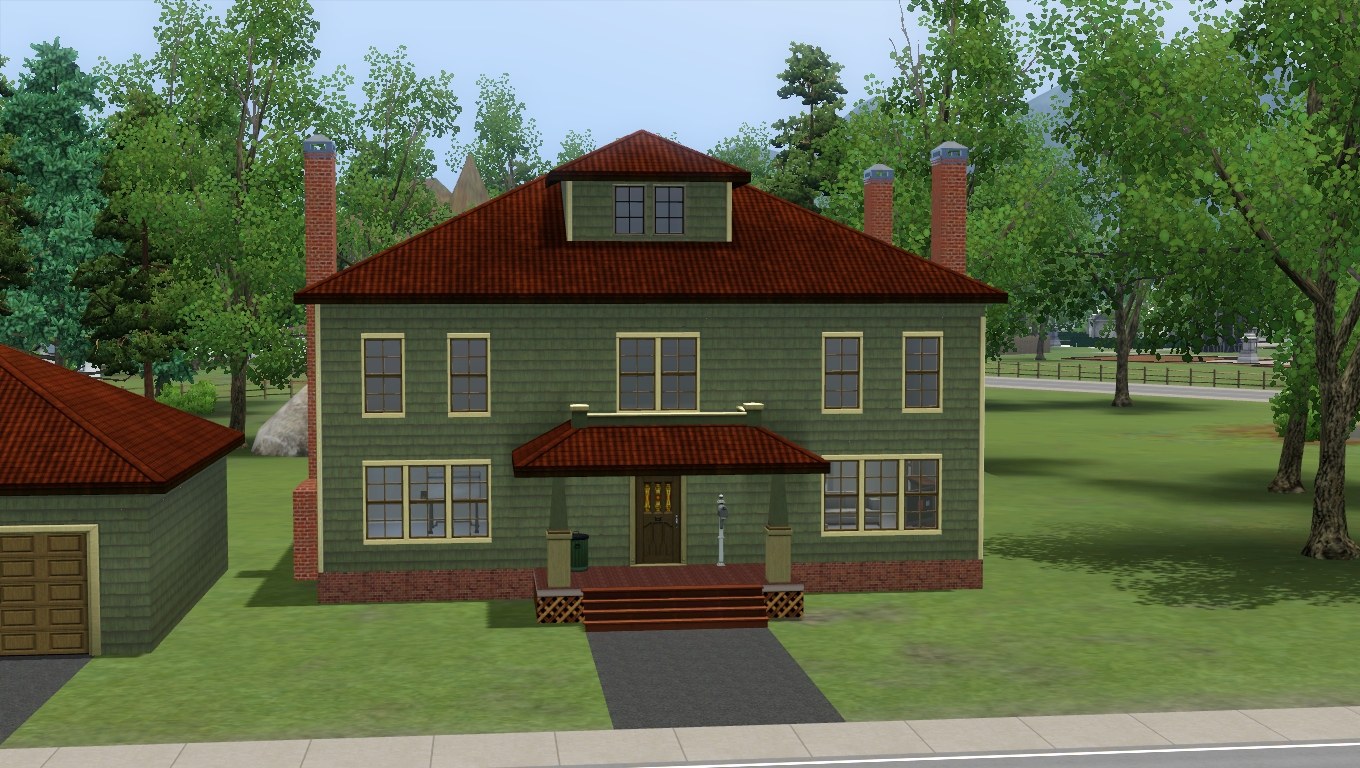
The first thing that jumps out at me is the overhang on one side. I should try to get rid of it if I were you. Then aligning the windows to make the façade symmetrical might help it too. I don't think the roof colour really goes with the stone wall covering either, so I would change one or the other to make them similar colours. But it's a good start so far. 

Lab Assistant
#3
27th Jun 2015 at 5:57 PM
27th Jun 2015 at 5:57 PM
Posts: 151
Agree with Fergus. Roof is too overwhelming.
#4
27th Jun 2015 at 7:52 PM
27th Jun 2015 at 7:52 PM
Posts: 28
yeah the neanderthal brow is a big deal. it's gross to look at but when i try to even it out i either end up with much too little space on the top floor or too much space downstairs. that's how i ended up with those columns up the back (don't get me wrong i do want to utilize columns but those were supposed to just be temporary) should i just make the downstairs bigger and try to compensate the space?
and i have no idea what i'm doing when it comes to roofs; the flat-top one is the one that seemed the least out of place
and i have no idea what i'm doing when it comes to roofs; the flat-top one is the one that seemed the least out of place
Lab Assistant
#5
27th Jun 2015 at 8:11 PM
27th Jun 2015 at 8:11 PM
Posts: 151
Quote: Originally posted by bowcatbrenda
|
yeah the neanderthal brow is a big deal. it's gross to look at but when i try to even it out i either end up with much too little space on the top floor or too much space downstairs. that's how i ended up with those columns up the back (don't get me wrong i do want to utilize columns but those were supposed to just be temporary) should i just make the downstairs bigger and try to compensate the space? and i have no idea what i'm doing when it comes to roofs; the flat-top one is the one that seemed the least out of place |
When I build my houses I try to use many geometrical forms - my house is not one big square (IMO it looks bad), but many squares and some semi circles. Thus you can add more sections of roof.
I love House of Fallen Trees in TS2, remember? This is great example of house - lots of geometrical figures, ground zero is bigger then first floor, roofs and towers of different heights.
http://modthesims.info/download.php?t=421990 This house in MTS is one of the best houses ever built. I redid colours and all enviroment, but kept house layout untouched. See different forms? One tower is higher. Roofs are of different heights.
I think that one big box is not a good decision for house design.
#6
28th Jun 2015 at 12:21 PM
Last edited by Fergus' Mind : 28th Jun 2015 at 4:33 PM.
28th Jun 2015 at 12:21 PM
Last edited by Fergus' Mind : 28th Jun 2015 at 4:33 PM.
Quote: Originally posted by bowcatbrenda
|
yeah the neanderthal brow is a big deal. it's gross to look at but when i try to even it out i either end up with much too little space on the top floor or too much space downstairs. that's how i ended up with those columns up the back (don't get me wrong i do want to utilize columns but those were supposed to just be temporary) should i just make the downstairs bigger and try to compensate the space? and i have no idea what i'm doing when it comes to roofs; the flat-top one is the one that seemed the least out of place |
I think you should just make the downstairs bigger as one thing I was planning on mentioning was that your entrance hall seems too grandly proportioned for the rest of the house, so making the room to the right of it a bit bigger would counteract this.
As for the shape of the roof, I think it's alright, the colour of it just doesn't really go with the wall coverings of the exterior. I have a couple of ideas for what you could do with the front, but rather than try and explain them, what I'll do is recreate the basic structure of your house and alter it to show you exactly what I mean with pictures.
With some alterations, your home could easily become a Craftsman style home in the Foursquare form.
Edit:
Here's what I'd suggest doing with the exterior, in the process of fiddling with the exterior I also fiddled about with the internal layout.

#7
30th Jun 2015 at 5:25 AM
30th Jun 2015 at 5:25 AM
Posts: 2,790
Thanks: 5022 in 40 Posts
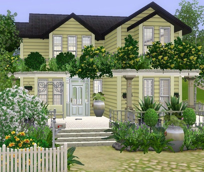
If you want to keep the overhang you could make the piece under the overhang a porch or veranda... Just a thought. Something like the picture below?
#8
1st Jul 2015 at 10:32 AM
1st Jul 2015 at 10:32 AM
Posts: 28
sorry i'm dealing with a few irl problems that have piled up as well as a saving issue in game. i really like these ideas and appreciate that you guys are taking the time to offer some help. i'll be back soon with a good response as well as some edits that may help
#9
2nd Jul 2015 at 1:04 PM
2nd Jul 2015 at 1:04 PM
Or you could always give it a more Neoclassical look?
#10
7th Jul 2015 at 7:59 PM
7th Jul 2015 at 7:59 PM
Posts: 28
so to update this thread my life is in order but my game won't save when i go into build/buy. not sure why but i'm trying to fix the issue as i type.
that's exactly the look i was initially going for.
i'm gonna make some of the edits you've shown me here but i want to keep it a bit more open between the dining room and kitchen. i wanna know what you think
go here for memes
Quote: Originally posted by Fergus' Mind
| Or you could always give it a more Neoclassical look? |
that's exactly the look i was initially going for.
i'm gonna make some of the edits you've shown me here but i want to keep it a bit more open between the dining room and kitchen. i wanna know what you think
go here for memes
Who Posted
|
|